As our company evolves, so must our expression of it. Through the successes and growing pains over the past two years since we started Participate, Inc., we’ve uncovered the heart of who we are — the place where the world learns together.
That self-exploration and imperative teamwork inspired and guided the brand you see today. In formally stepping into our resized shoes, developing a visual brand identity to encompass and celebrate the core of who we are was the natural next step. As Participate’s graphic designer, I’ve worked with our team to create this visual exemplification that brings our brand to life.
Now, how did we get here?
Back to basics
A successful brand direction requires a clear vision of our personality and how we exist in the world. It’s what connects us to you, our audience and partners, and makes us unique. A brand personality operates much like our own personalities. What are our interests? How do we relate to others? What do we value?
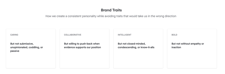
To build this personality, we gathered perspectives from across the organization to identify the various personality traits and characteristics of our brand. In workshops, conversations and collaborative brainstorming sessions, staff members were asked to describe our traits and the feelings they give off.

Brand trait activity
|
“I see Participate as that friend you are still friends with 20 years after freshman year. The person you had fun with at a party but also at the library, when you had to get work done. Always there to lend a hand and help you when you struggled. Later in life you continue to be friends even when you both grow and explore different directions. Despite your shared history, when you get together you're always discussing the exciting things ahead, always ready to take on the next adventure with you. Unlike Steve, who is always talking about the goal he scored to win the State Championship. Get over it, Steve.” |
Excerpt from staff brainstorm session
Through this process of cross-departmental self discovery, we landed on:
Like a new adventure companion, Participate is committed to exploring alongside our partners. Our lighthearted spirit is not without grounding and sound insight. We take an inclusive approach that ensures our partners feel understood and welcomed. We are goofy, data-driven, lovers of learning and deeply collaborative.
Explanation of brand traits
But if Participate were truly a person, we’d need a visual identity to encompass these traits. What outfit would Participate wear? The colors, textures and detail were what we sought to uncover next.
Design. Iterate. Improve.
A visual identity translates the abstract ideas of a brand into a concrete look and feel. We started designing our identity through colors, shapes, textures, patterns and layouts that would bring our brand traits to life.
Initial logo and icon sketches

Draft illustrations to convey brand traits

With each iteration, we explored a new approach to expressing our brand. What would the most accessible visual branding look like? What if we explored an analogous color palette? Do we want an identifiable logo stamp incorporated throughout our channels? Does this feel like us?

First iterations of our visual identity

Authentic feedback and collaboration are central to our platform and organization, so it was only natural to go through multiple iterations of design and review to ensure our brand was a true representation of who we are. The brand needed to capture everything from marketing, development, operations, customer success, sales, our users and our partners, so we used a series of asynchronous surveys, informal Zoom chats and our own platform to gather feedback and apply new perspectives to the design.
Staff-wide feedback and review session


Survey feedback
Our new brand
If you allow it, creativity can go wild. We set some goals and parameters to guide the direction of our vision. First, we wanted our rebranded look and feel to be connected to our original branding — to retain the core of who we are. Second, we aimed for purposeful, well-crafted simplicity. Each element included in our visual identity was created with intention to convey our message and connect with you.
After two iterations (and a lot of thought, inspiration, and feedback) of color palettes, doodles, and shapes, we landed on our perfect fit, pictured below.
New brand look/feel

.png?width=2856&name=image%20(7).png)
Platform mockup with new brand
Color
Guided by our brand traits, we looked into colors that would embody delight, boldness, collaboration, professionalism and adaptability. Naturally, a combination of joyful yellows, bold pinks, inspiring blues and nurturing greens created a versatile palette. We approach learning alongside our partners with a fun and bright outlook, and our colors are a direct reflection of that.

Participate color palette
Shape
Just as online Communities of Practice are built with various ideas, backgrounds and knowledge, our brand uses various shapes to create illustrations and visualize community concepts. To reflect the diversity of ways in which we learn, connect and grow, a staple of our illustration style is the layering of our classic shapes and weaving flowing lines to demonstrate that connection and the ebbs and flows of learning. Shapes are universally understood, dynamic and accessible, and designing with rounded shapes aligns with our commitment to designing an inclusive platform and organization.
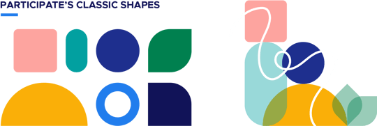
Participate shapes
Patterns/Texture
Patterns and texture help give us a sense of actualization and convert a sense of physical touch to a digital space. They can also be used to uplift the presence of other visual elements. To add a fresh, lifted feel to our visual palette, we use a subtle glow effect around emphasized elements.

Glow effect in illustration
Layout
Layout involves the space between lines and different visual elements in a given group and impacts a viewer’s overall aesthetic experience and comprehension. More white space, which we opt for, allows content (and users) to breathe. We aim to be a space where users can discover, engage and learn with ease.
Logo

Embedded in our approach to learning, our logo is inspired by the inner-outer loops of a Community of Practice. Through this representation, our philosophy becomes the visual marker of our brand. The text is a renewed version of our classic logo. The thicker lines help exemplify our bold nature, while the updated navy instills our professionalism. The yellow adds a touch of warmth to highlight areas for connection and gives a friendly, personable feel to the logo.

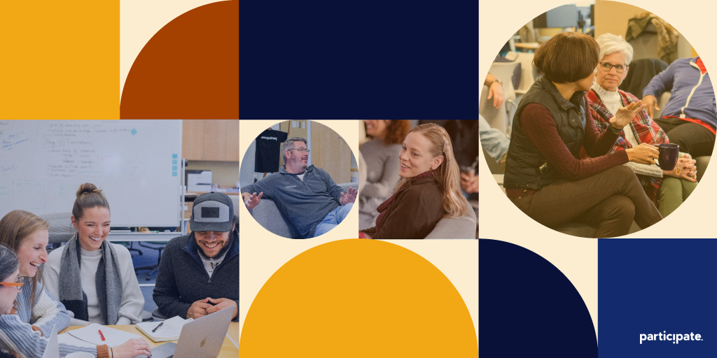
Photography
We use inclusive, bright photography as a way to celebrate the diverse human identities represented in our user base. Feeling like you can see yourself in our ecosystem is of utmost importance to us.
Our visual brand is the expression of our character come to life. At Participate's core, we are knowledge creators dedicated to being the place where the world learns together. Our approach is centered in building community, and we value being a place where inclusion, delight and daring to be bold are at the forefront of everything we do.
Ready to explore more? View the new participate.com.