![icon_bank[2023]_idea](https://www.participate.com/hs-fs/hubfs/icon_bank%5B2023%5D_idea.png?width=400&height=400&name=icon_bank%5B2023%5D_idea.png)


Color contrast and accessibility →
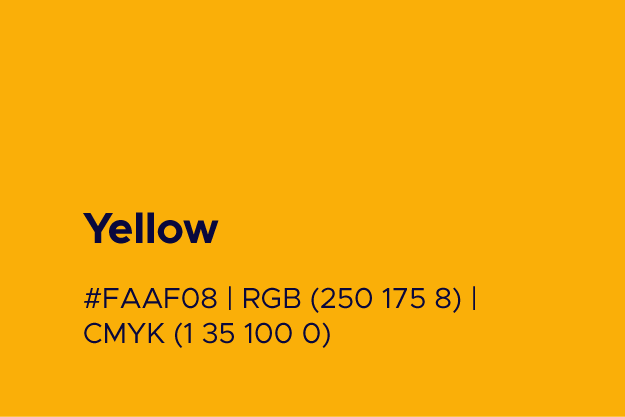
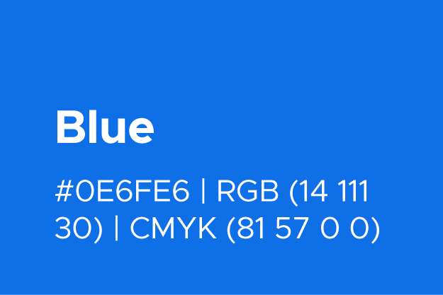
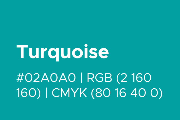
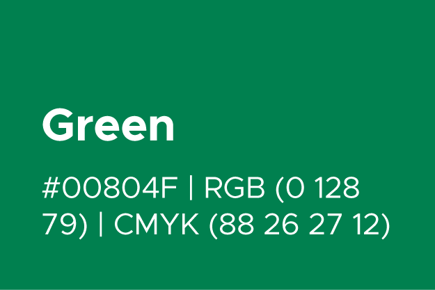
In order to align with accessibility standards, combinations of our brand colors have been tested with an ADA compliance contrast ratio checker to determine which colors have the best outcome for easy readability. These combinations are primarily recommended for text readability at all sizes, and will be adhered to across all content creation. With graphics and illustrations, the color combinations are more flexible; however, we recommended that you check color contrast ratios for colors as you design.
The colors combinations below are compliant with accessibility standards. For example, when using a yellow background and deciding on a text color, you may pair it with our navy, blue or black.


![icon_bank[2023]-06](https://4741265.fs1.hubspotusercontent-na1.net/hubfs/4741265/icon_bank%5B2023%5D-06.png)
![icon_bank[2023]_idea-1](https://4741265.fs1.hubspotusercontent-na1.net/hubfs/4741265/icon_bank%5B2023%5D_idea-1.png)
![icon_bank[2023]-08](https://4741265.fs1.hubspotusercontent-na1.net/hubfs/4741265/icon_bank%5B2023%5D-08.png)
![icon_bank[2023]-04](https://4741265.fs1.hubspotusercontent-na1.net/hubfs/4741265/icon_bank%5B2023%5D-04.png)
![icon_bank[2023]-03](https://4741265.fs1.hubspotusercontent-na1.net/hubfs/4741265/icon_bank%5B2023%5D-03.png)
![icon_bank[2023]_article](https://4741265.fs1.hubspotusercontent-na1.net/hubfs/4741265/icon_bank%5B2023%5D_article.png)
![icon_bank[2023]_notification](https://4741265.fs1.hubspotusercontent-na1.net/hubfs/4741265/icon_bank%5B2023%5D_notification.png)
![icon_bank[2023]_schedule](https://4741265.fs1.hubspotusercontent-na1.net/hubfs/4741265/icon_bank%5B2023%5D_schedule.png)
![icon_bank[2023]-02](https://4741265.fs1.hubspotusercontent-na1.net/hubfs/4741265/icon_bank%5B2023%5D-02.png)
![icon_bank[2023]_recognition](https://4741265.fs1.hubspotusercontent-na1.net/hubfs/4741265/icon_bank%5B2023%5D_recognition.png)
![icon_bank[2023]-05](https://4741265.fs1.hubspotusercontent-na1.net/hubfs/4741265/icon_bank%5B2023%5D-05.png)
![icon_bank[2023]-10](https://4741265.fs1.hubspotusercontent-na1.net/hubfs/4741265/icon_bank%5B2023%5D-10.png)
![icon_bank[2023]_community](https://4741265.fs1.hubspotusercontent-na1.net/hubfs/4741265/icon_bank%5B2023%5D_community.png)
![icon_bank[2023]_impact](https://4741265.fs1.hubspotusercontent-na1.net/hubfs/4741265/icon_bank%5B2023%5D_impact.png)
![icon_bank[2023]-01](https://4741265.fs1.hubspotusercontent-na1.net/hubfs/4741265/icon_bank%5B2023%5D-01.png)